UI/UX Please Don't
May 5, 2020 - by David
It is sometimes easier to avoid doing bad things in developing a quality user experience than it is to do them well. These are some obvious rules and reasons for things to avoid at all costs.
A few of these are blatant faux pas. Some are just design fads, and will go the way of the animated email icon.

Steal Scroll Behavior
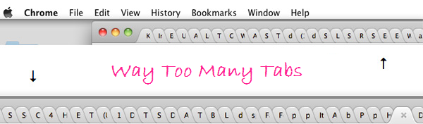
It has become popular to make website landing pages stretch to fill the whole viewport for branding reasons. That is fine, and can look nice if done well. However, never steal the browser’s underlying scroll functionality, and don’t double down by adding a throbbing chevron at the bottom.
Your custom Javascript, or more likely jQuery plugin, will never be as smooth as the native operating system.
You added a chevron because people didn’t realize they could scroll? Now you made it bounce up and down because no one noticed that? You just did 2 custom, lesser known, things, to reproduce basic scrolling, something everyone has grown familiar with over the last 20 years.
Rodrigo Muniz makes the point very well in Dear web designer, let’s stop breaking the affordance of scrolling. It is also pointed out that when everyone is doing it, it’s not even very creative or unique.
Reveal on Scroll
Another popular yet incredibly annoying “design”, is to reveal the content below the fold, slowly, using a fade in animation. Even worse is when the text and/or images are slid into view from seemingly nowhere. Where were those things coming from? What the hell were they doing hiding out of view?
Your content should “sell itself” and be given to your “customers” when they asked for it, not in some David Blaine style reveal.
Dark Mode
Please stop.
Do you have an application or website that has been around for 6+ months with users? There must be features your users have requested. Are you a new startup without customers or users, then you need those. In almost every situation, actual paying customers requests should supercede dark mode.
Implementing dark mode tells all of your customers/users that you prioritize that over everything they requested that you didn’t do instead.
“It looks cool though!” What was wrong with your original design? Why didn’t you prioritizing improving that over spending time on something less than 5% of users care about?
“It’s really easy, just a few CSS variables!” Are there no other variables you could change to improve usability. Have you checked your font face, size, kerning, line height, etc for readability?
Are you currently, or planning on, testing your UI/UX? Well, now you’ll have 2 interfaces to test. You will end up removing “dark mode”, or just not porting it over in a rewrite, it’s just a matter of when.
It also turns out that dark mode is less usable than light mode!
Autoplay Video
This is one of the most egregious and obnoxious. One second of video streaming can weigh more in bytes than the entirety of your UI without it. It can also slow the entire experience down as your browser provisions the GPU for streaming video decoding and rendering.
Autoplaying video on page load, if you’re not actually YouTube, Vimeo, etc, is equivalent to loudly running your mouth in every room you enter, unprompted. Would you be invited back in real life? Probably not. Will people have a good experience and want to return to your site? Also, probably not.
This is what Fox Business looks like when you click on an article, but this travesty is not at all unique to them.
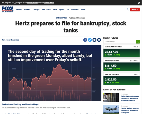
If you break down the screen real estate used by the video, it accounts for 377,200 pixels, or 34.4% of the viewport, and that video isn’t even specific to the article text!
Catch Me If You Can
Moving autoplaying videos into another position only compounds the original problem. Now, after the user scrolls to read the article they actually wanted, you continue to autoplay streaming video with audio, but also move it around the screen?
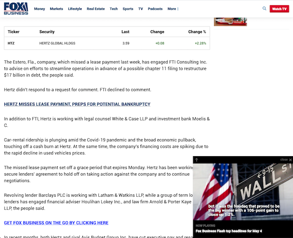
Don’t ever automatically move key UI elements around the screen, especially if they’re not even what the user wanted in the first place, and you know this.
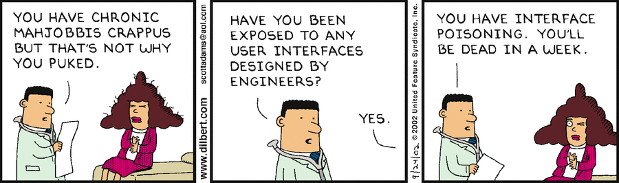
Layers
In this example from Chase’ UI, they’re sharing an important notification about recent events. However, if you’ve addressed it, and click to dismiss it, the “Sign Out” button appears directly below. The slightest twitch in clicking the “X” and you’ve now also signed out!
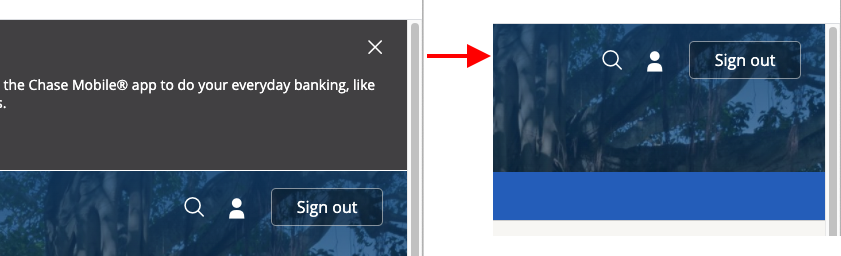
Avoid using layered UI, expecially on the web, which is a “page” style model. Layered UI, such as dismissable panels or modal dialogs, are almost always a way to fix another problem that only makes them worse.
Never, ever stack functionality with vastly different implications. In the example above, “dismiss” and “sign out” are wildly different actions.
Broken Promises
If you’re not honoring a promise anyway, stop making it.
In 3+ years of using Hertz’ online booking, not once has their “Remember Me” function worked. A whole case study of what not to do could be made from their interface. Not only do they not remember you, they log you out faster than every actually useful application.
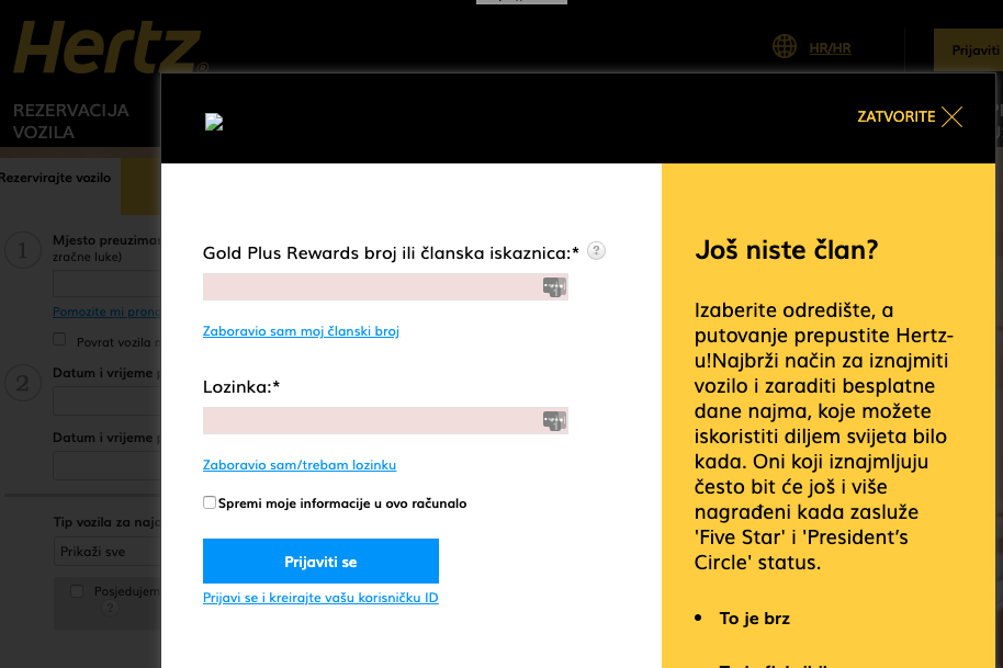
To top it off, they don’t even bother remembering what language you’ve used the past 3 years, the above is in Croatian. They’re clearly using IP address to resolve the language, which would be nifty, if the browser hadn’t explicitly sent accept-language: en-US,en; in the request! Icing on the cake, the header logo image is broken.
“But the code is already written and in there!” If it doesn’t work, just disabled it, remove the UI, and mark the code for deletion. It failed, let another engineer try.

Don't say "I know"
February 21, 2026 - by David
It's not really possible in a probabilistic world.

Demote Paywalls
February 15, 2026 - by David
Google Search is still the "gold standard" for finding information on the internet.

Environmentalism is Bullshit
February 14, 2026 - by David
The hypocrisy in the supposed environmentalism movement is so blatant that it is impossible to take it seriously.

What is Value?
February 9, 2026 - by David
Everyone knows "price" and "quality", but ignores "value".
Stop with the negative and wrong emojis!
January 30, 2026 - by David
What the hell is this? Why is auto-suggest giving me an emoji that I have never used, ever? And, why the hell is it the "Loudly Crying Face" emoji?

Go to Your Happy Place
January 19, 2026 - by David
So much meditation practice asks you to find a "happy place." But what does that really mean?

Universal Symbols
January 18, 2026 - by David
How many symbols are enough to communicate across cultures and languages in an increasingly interconnected world?
Specialized AI and the Road to AGI
January 12, 2026 - by David
Exploring the future of specialized artificial intelligence and its path towards artificial general intelligence.

Simple Steps for Securing Your Data
January 5, 2026 - by David
Practical advice on how to protect your personal information and maintain your online security.

Go-Bag Packing Checklist
December 31, 2025 - by David
A comprehensive checklist for packing an emergency travel go-bag.

Dev bookmarks
April 26, 2022 - by David
A collection of bookmarks to interesting dev projects or resources.

The Joe Rogan bot
December 19, 2021 - by David
Prolific podcasters/vloggers/bloggers or even social media users, in the future, will be able to recreate a "bot" of themselves that easily crosses the uncanney valley.

Everything is a System
September 17, 2020 - by David
The entire physical universe acts as a system, from the galaxies all the way down to the sub-atomic level.

Original Sources
June 11, 2020 - by David
All interviews in the future will link to unaltered original video sources.
UI/UX Please Don't
May 5, 2020 - by David
A list of UI/UX implementations to avoid at all costs.
Importance of writing
April 30, 2020 - by David
Proper written communication is more important than ever.
Managing engineering teams
February 15, 2019 - by David
Thoughts on the best practices of the most efficient engineering teams.
No Comments
February 1, 2019 - by David
Don't bother with a comments section on a personal or company blog.
One Wish
January 7, 2019 - by David
The importance of quality user experience to crypto cannot be overstated.